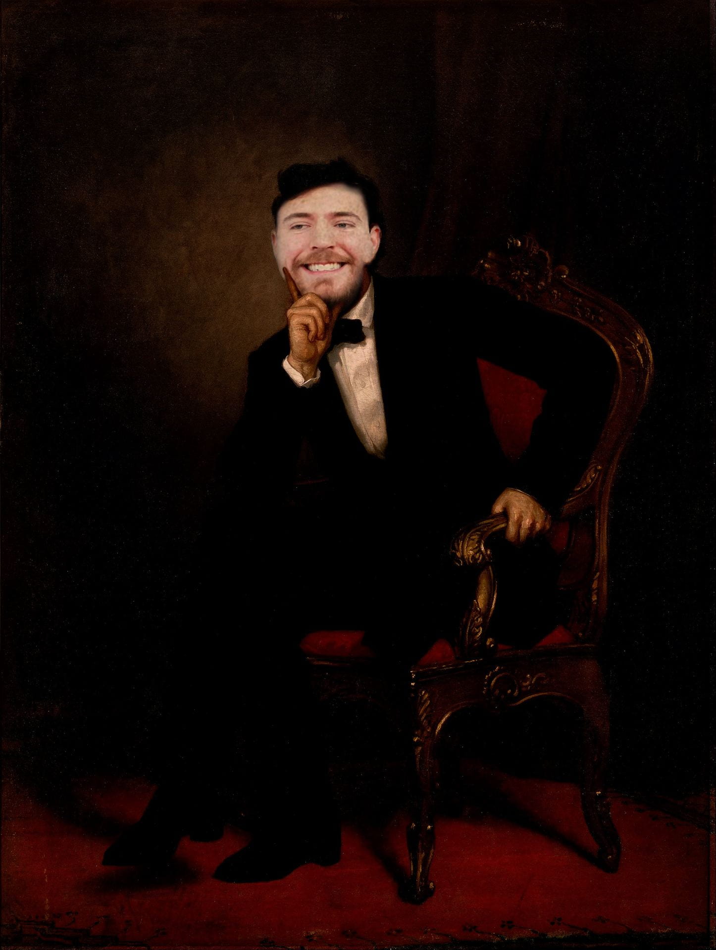
I want my picture to be funny to the viewer. The picture is showing that many connections between today’s figures can be compared to historical ones. I chose both of these people because they both chose to do everything for the greater good.
For someone looking to create a composite image in Photoshop, I would tell them to think of the figures first, before the connection. With many famous figures, they have done so much that almost any connection can be found between them.
I like how he added 2 cool people. I think it is cool how they both help the world. That is a good idea. I think he could have picked a better picture. It does not do him any justice. Lastly, the flesh tones, they do not match. I would tell him to take his time. I think he could have done better with the flesh tones. He is good at it so he should stay with it.
Which image? Describe
Mr. Lincoln
What do you like most about the photo? Explain writing 3 sentences in the block to the right.
I like how he was able to get the hair to overlap Mr. Beast’s face perfectly. Additionally, Lincoln’s finger is perfectly placed over Mr. Beast’s face to make it actually look like it is resting on it. Finally, Mr. Beast’s headsize and placement fits perfectly with Lincoln’s.
What is one thing that could be better in the photo? Explain writing 3 sentences in the block to the right.
One thing that could be better in the photo is that Mr. Beast’s face contrasts with the rest of the image. The photo has a darker tone to it, while Mr. Beast is portrayed brightly on the screen. Additionally, changing Lincoln’s hair to Mr. Beast’s hair could have made it look better instead of contrasting two hair colors through the hair and Mr. Beast’s beard.
What one piece of advice for the photographer to help them make their work better next time? Explain writing 3 sentences in the block to the right.
One pice of advice for the photographer to help make their work better is to darken Mr. Beast’s face to help match the color tones of the picture. Additionally, Zade could have changed the hair to brown or to Mr. Beast’s hair to make his face blend in better with Lincoln’s. Finally, making Mr. Beast’s face have a bit more of a “painting” aesthetic could make it blend in more with the picture as well.
I like the weird connection made through the two people. I like that Zade chose people that do something for the greater good. Overall, I like the idea of the Cretu. The editing in photoshop could definitely be better. The face is a little too big for the body. The skin tones also don’t quite match.
Next time, Zade should spend more time editing in photoshop. He could match the skin tones between Mr. Beast and Lincoln. He could also choose a better photo of Mr. Beast to match the Lincoln photo better.
I like how funny the photo is to look at, it is truly entertaining. I also like the connection between the two figures, which is one that many might not understand. Lincoln and Mr. Beast are two very generous and influential figures, who are also both extremely tall. I like the connection and the irony in this photo.
The photo’s editing looks a little choppy, especially the hair and the face. The face looks stretched and the skin color doesn’t match that of the rest of the body. I feel as if it wouldn’t have been that difficult to try and edit the photo to change the skin color a few shades and make it look more similar to the body.
One piece I have is to take your time. Don’t rush through your photo/editing or you’re definitely going to miss things you could have easily improved upon if you spent a little more time and energy. I like the photos that Zade took, but this one definitely feels a little rushed and a little extra time could have definitely solved your problems.