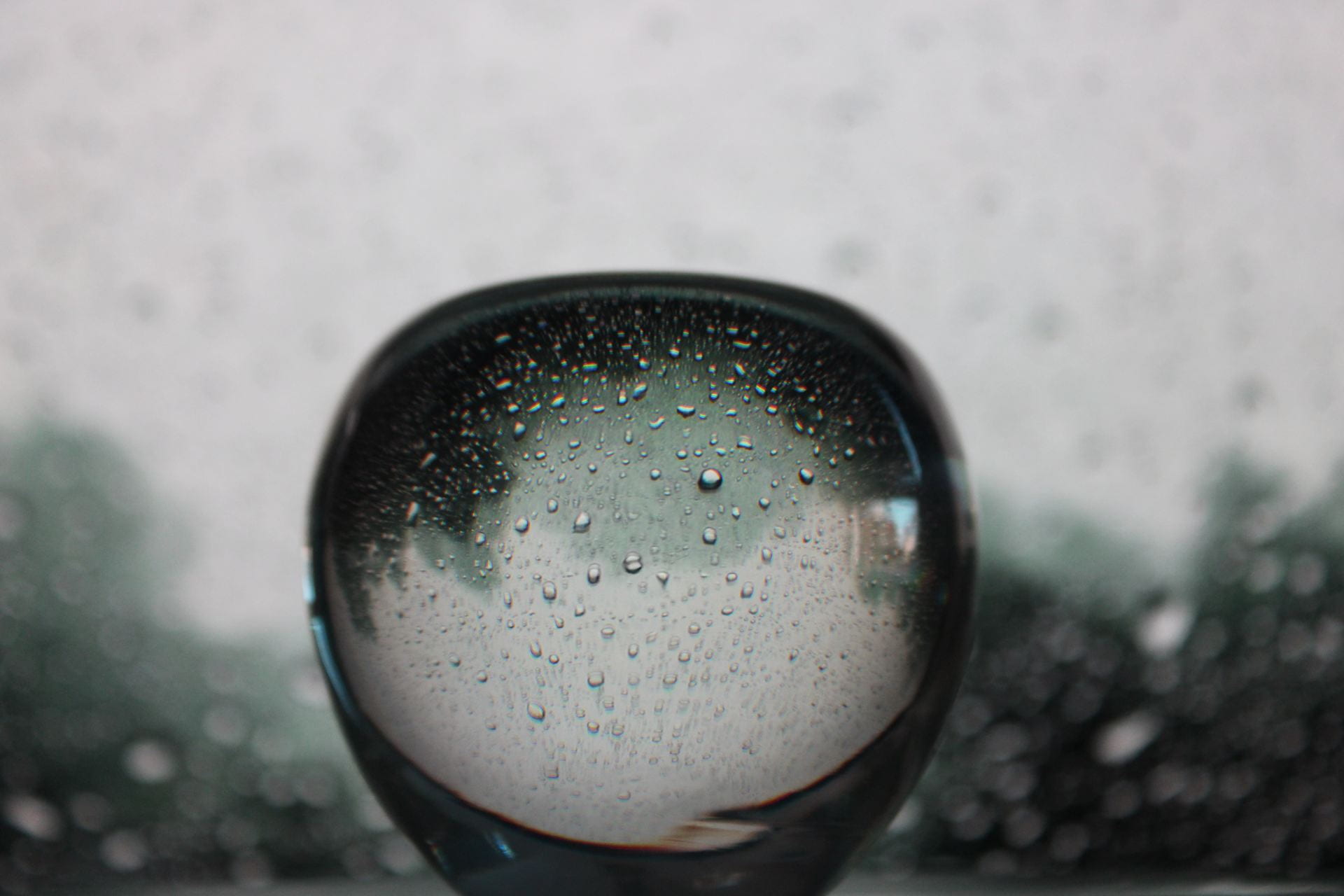
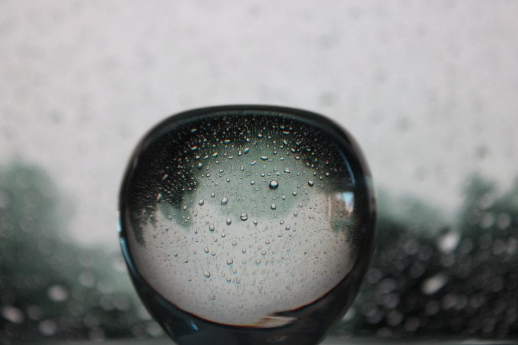
Refraction
a. What is the distinct mood of the photograph? Explain.
The mood of the picture is dreary as seen by the water falling down.
b. What does the photo make you think about? Explain.
The photo makes me think about a weekend night staying home hearing the rain coming down on the roof.
c. What in the photo jumps out at you? Explain.
The apple, being centered in the picture, first jumps out at me.
d. How does the photo make you feel? Explain.
The picture makes me feel calm and safe, as that is what I relate rain storms to.
e. What advice would you give to next year’s students for shooting abstract photography? Explain.
For next year’s students, I would let them know that you can make a good photo out of anything for abstract photography. If they like something they see, there is no reason to not take a picture of it.
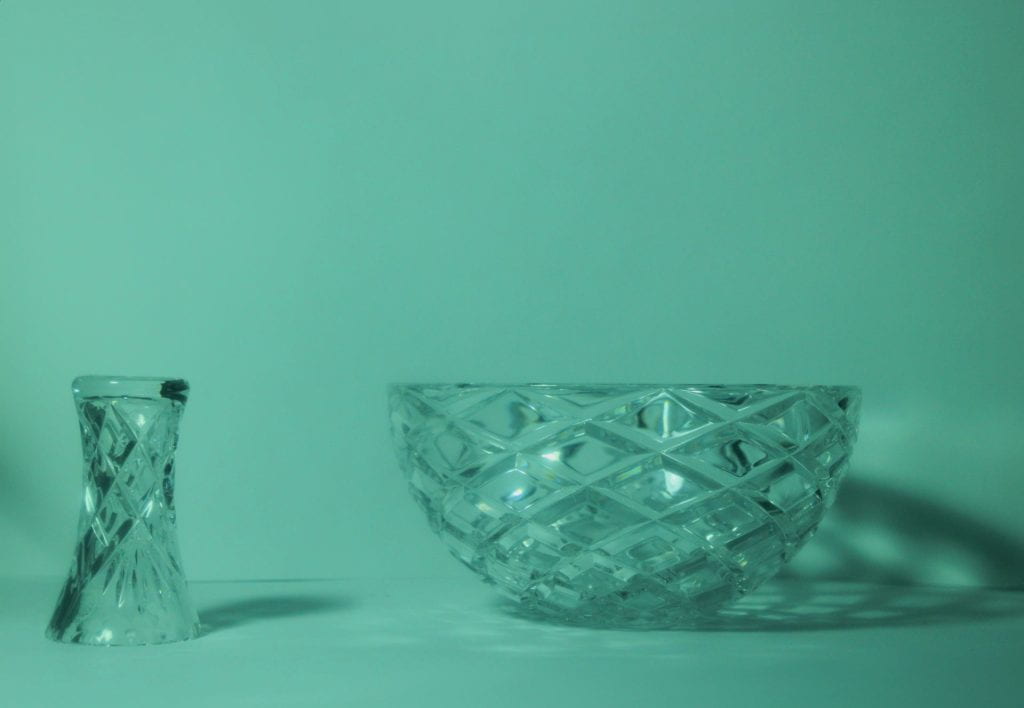
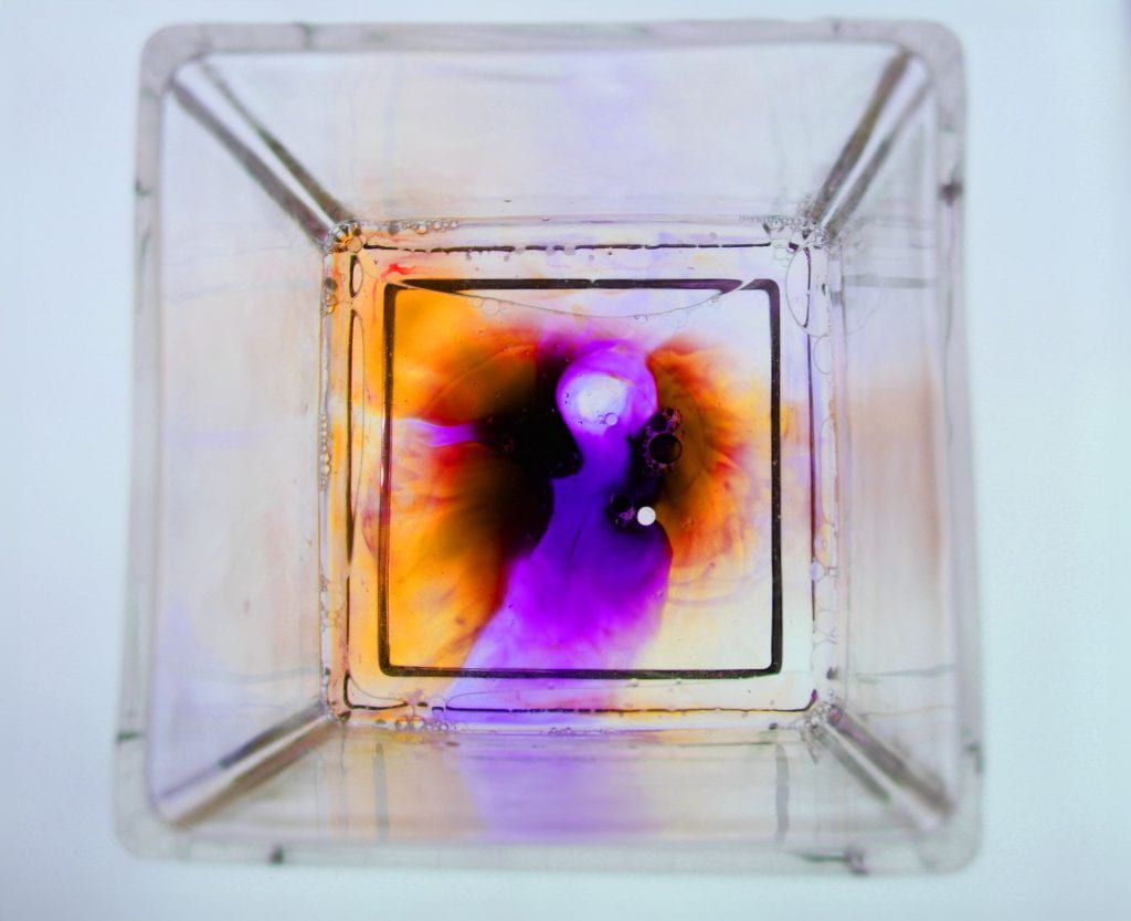
Which image? Describe
Water Beads
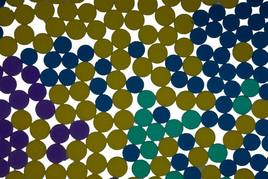
What do you like most about the photo? Explain writing 3 sentences in the block to the right.
I really like the contrast between each water bead. The lines between each orb created by the water makes a cool effect that adds to the contrast due to the close proximity. Additionally, it is really cool how they appear to be two dimensional and three dimensional at the same time.
What is one thing that could be better in the photo? Explain writing 3 sentences in the block to the right.
A few things that could have been better about the photo is whitening the two gray spots on the top and bottom left to match the rest of the white background. Spreading out and diversing the colors more could’ve potentially made the picture look cooler. Right now, there is a very clear dominance in yellow that slightly overtakes the other colors, especially green and purple.
What one piece of advice for the photographer to help them make their work better next time? Explain writing 3 sentences in the block to the right.
I would say using red in your picture would have definitely added to the contrast. Additionally, adding more of green, purple, and read would help offset the overwhelming amount of yellow in the picture. Finally, touching up the grey spots to match the white would help make the picture look complete.
Water beads:
I like the colors of the beads in his photo. I find the color of the yellow beads to really pop out. His color choice creates a very interesting photo.
One thing that could be better in the photo is his brightness. Also, he could turn up his photo’s vibrance. If he did these two things, I feel that his photo would be more appealing to look at.
One piece of advice I’d give Zade is to give the beads more depth. The beads in his photo look two-dimensional. I feel that if he made the beads more three-dimensional, his photo would be better.